Right now, the housing market looks very different depending on where you are. In some states, buyers are starting to gain the advantage, while in others, sellers are still calling the shots. Wondering how things are playing out where you live?
These 3 maps break down how things are shaking out across the country. Here’s what each one shows:
- Darker Shades of Blue = Buyer friendly
- Lighter Shades of Blue = Seller strong
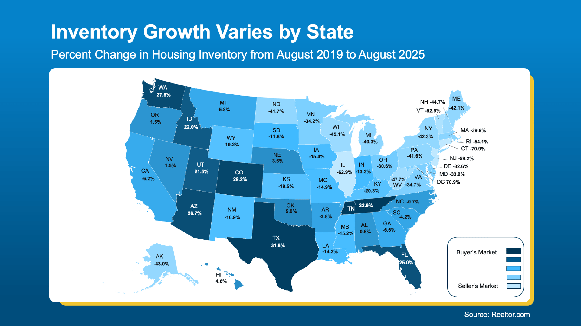
Inventory Sets the Stage
Even though there are more homes for sale almost everywhere, the amount of growth really depends on where you live. And that difference is what decides who has the upper hand in today’s market.
This map, pulled from Realtor.com data, helps break it all down:
- The darker blues highlight areas where inventory has grown the most. That means buyers there have more options on the market and a better chance to negotiate a deal.
- The lighter blues mark spots where inventory is still tight, so sellers there are more likely to see quick sales with fewer give-backs.
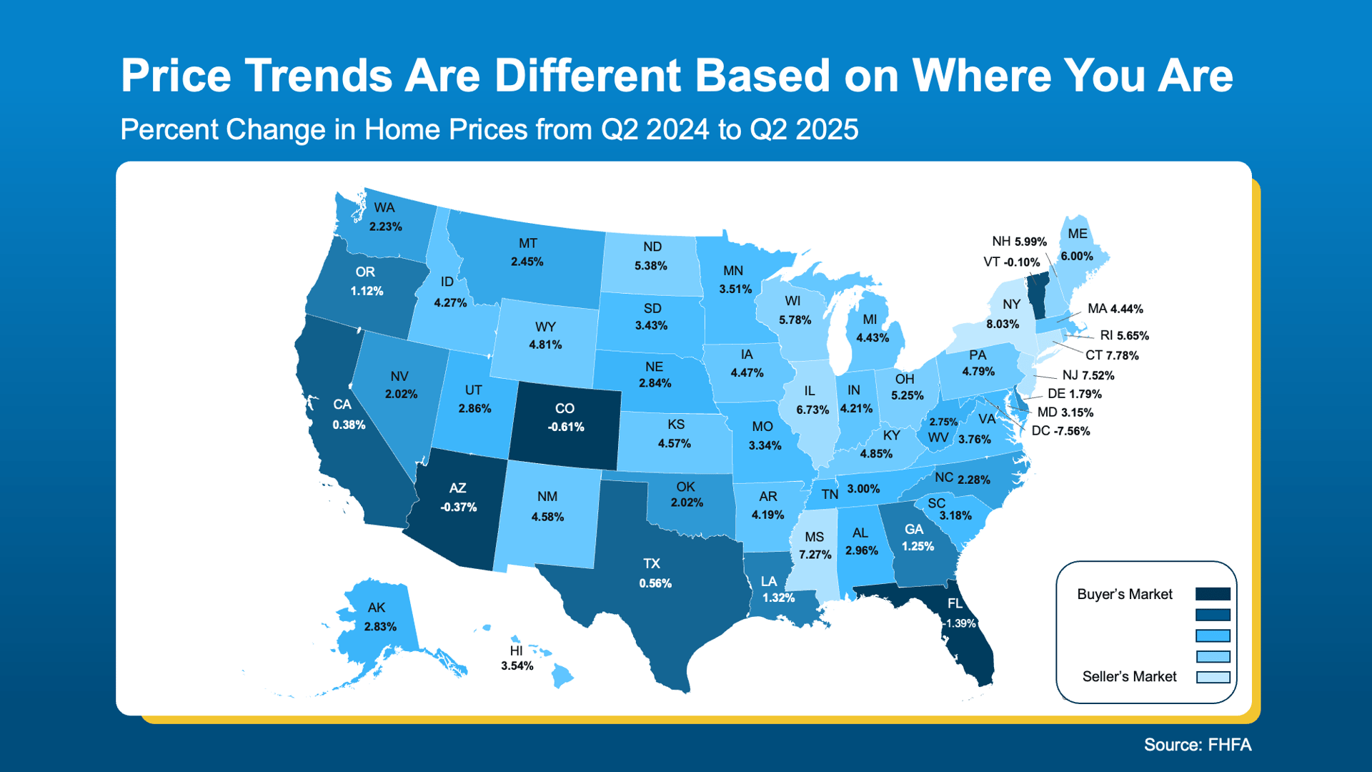
Prices Follow Inventory
The second map shows how home prices are changing state by state. Just like before, you can see the split pretty clearly. A lot of the same areas show up in darker blue, and that’s no surprise—inventory and prices are closely connected. When there are more homes for sale, prices tend to level out.
-
The darker blues mark spots where prices are holding steady or even dipping a bit. With more homes on the market, sellers may need to lower their price or offer concessions to close the deal—good news for budget-conscious buyers.
-
The lighter blues highlight areas where prices are still climbing. Since inventory is tight, sellers here can see more competition among buyers, which drives prices up.
Time on Market Tells the Same Story
Finally, this map shows how fast homes are selling in each state. Notice the colors? They mostly follow the same trend, with many of the darker blues showing up in the southern states. Here’s what’s driving that.
Overall, when there are more homes on the market, they tend to take longer to sell. That’s why the areas with higher inventory are also the ones where sales are slowing down a bit.
-
The darker blues point to places where homes are taking longer to sell. That gives buyers more breathing room and choices, while sellers might need to be a bit more flexible.
-
The lighter blues show where homes are still selling fast. Sellers in those spots can feel confident, but buyers will want to move quickly.
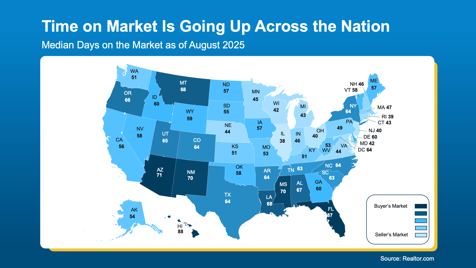
This is why some sellers in the darker blue states are getting frustrated when their homes sit on the market, while in the lighter blue states, sellers are still watching their homes get scooped up quickly.
Why an Agent’s Local Expertise Is the Key To Unlocking Today’s Market
Basically, the housing market is split right now, and your experience will look very different depending on where you live, where you’re headed, and whether you’re buying or selling. State-level data is helpful, but what really counts is what’s happening in your own town and neighborhood. That’s where a local agent can give you the insights you actually need.
Bottom Line
Curious about what the market looks like in your neighborhood?
If you’re wondering where you stand in today’s market, let’s chat. I’ll walk you through the numbers and what they mean for your next move.